Dashboard Redesign
Dashboard Redesign

SUMMARY
SUMMARY
SUMMARY
Enable Users to Efficiently Access Information About Residential Properties' Value
Enable Users to Efficiently Access Information About Residential Properties' Value
Enable Users to Efficiently Access Information About Residential Properties' Value
The goal is to improve the usability of dashboards for appraisers who value Build-to-Rent properties. Our goal was to create a streamlined experience that allows users to easily access each dashboard and compare data, ultimately making it simple for appraisers to use these essential tools. This is a project I did for my internship.
The goal is to improve the usability of dashboards for appraisers who value Build-to-Rent properties. Our goal was to create a streamlined experience that allows users to easily access each dashboard and compare data, ultimately making it simple for appraisers to use these essential tools. This is a project I did for my internship.
The goal is to improve the usability of dashboards for appraisers who value Build-to-Rent properties. Our goal was to create a streamlined experience that allows users to easily access each dashboard and compare data, ultimately making it simple for appraisers to use these essential tools. This is a project I did for my internship.
My role
UX design intern
My role
UX design intern
My role
UX design intern
Team
1 designer (Me) , 1 project manager
Team
1 designer (Me) , 1 project manager
Team
1 designer (Me) , 1 project manager
Time
Jul. 2022- Aug 2022
Time
Jul. 2022- Aug 2022
Time
Jul. 2022- Aug 2022


Overview
Redesign dashboards to enable users to efficiently
access information about residential properties' value
Overview
Redesign dashboards to enable users to efficiently access information about residential properties' value
Overview
Redesign dashboards to enable users to efficiently
access information about residential properties' value
01. CONTEXT
01. CONTEXT
01. CONTEXT
What Are These Dashboards?
What Are These Dashboards?
What Are These Dashboards?
WHAT?
WHAT?
WHAT?
These Tableau dashboards are used by appraisers to evaluate BtR (Build-to-Rent) properties. They provide access to information such as property details, tenancy analysis, and occupancy rates.
These Tableau dashboards are used by appraisers to evaluate BtR (Build-to-Rent) properties. They provide access to information such as property details, tenancy analysis, and occupancy rates.
TARGET
USERS
TARGET USERS
TARGET
USERS
Appraisers valuing BtR (Build-to-Rent) properties.
Appraisers use the dashboards to gain insights and ensure that the valuations are accurate.
Appraisers valuing BtR (Build-to-Rent) properties. Appraisers use the dashboards to gain insights and ensure that the valuations are accurate.
PROBLEM
PROBLEM
The current dashboards were constructed solely by the developers, without any involvement from the design team and we have received user complaints regarding the usability of the dashboards.
The current dashboards were constructed solely by the developers, without any involvement from the design team and we have received user complaints regarding the usability of the dashboards.
02. RESEARCH
02. RESEARCH
02. RESEARCH
Better Understand User Needs with User Research Data
Better Understand User Needs with User Research Data
CURRENTLY...
CURRENTLY...
To start the process of redesigning the dashboards, I collaborated with our PM and reviewed complaints we got from users regarding the usability of the dashboards.
To start the process of redesigning the dashboards, I collaborated with our PM and reviewed complaints we got from users regarding the usability of the dashboards.
USER PAIN POINTS
USER PAIN POINTS
To examine how appraisers use the dashboards and identify any difficulties they encounter, I read through the previously conducted user research report and identified 3 user pain points with the current dashboards:
To examine how appraisers use the dashboards and identify any difficulties they encounter, I read through the previously conducted user research report and identified 3 user pain points with the current dashboards:

Difficulties With Navigation

Poor Readability
Data Analysis Inefficiency
03. DESIGN
03. DESIGN
03. DESIGN
To Solve Difficulties With Navigation...
To Solve Difficulties With Navigation...
PROBLEM
PROBLEM
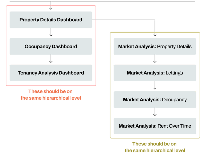
Users struggle with navigating between pages to compare data on current dashboards. Two key navigation problems were identified: the property details, occupancy, and tenancy analysis dashboards should be at the same level in the hierarchy, and all market analysis pages should also be at the same level.
Users struggle with navigating between pages to compare data on current dashboards. Two key navigation problems were identified: the property details, occupancy, and tenancy analysis dashboards should be at the same level in the hierarchy, and all market analysis pages should also be at the same level.
SOLUTION
SOLUTION
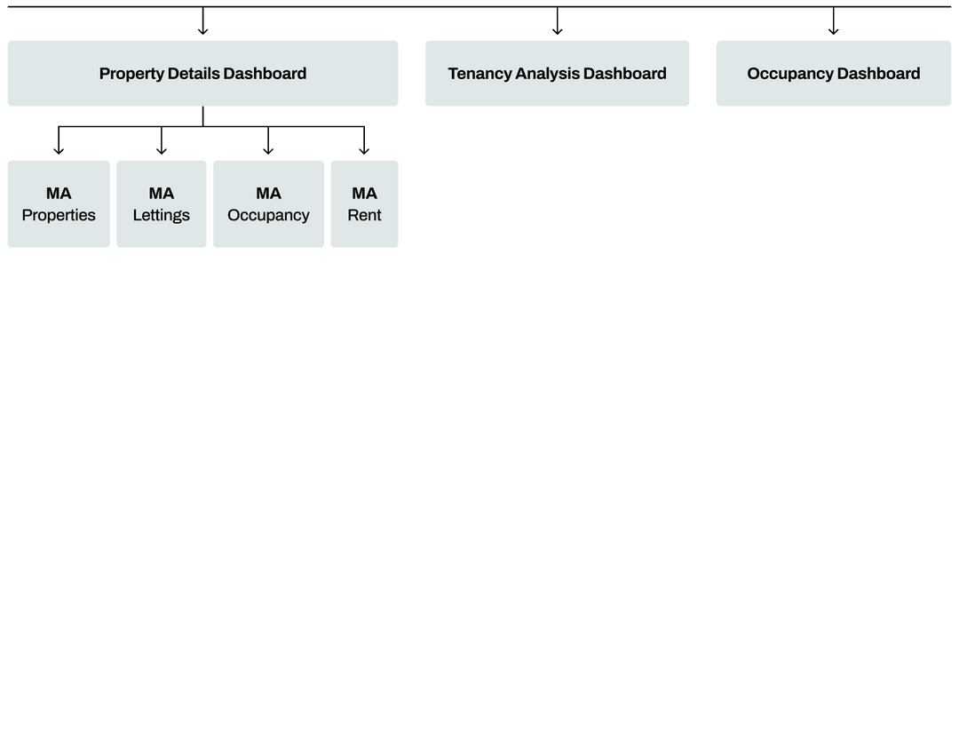
To solve the navigation problems, I redesigned the sitemap for improved efficiency. Users can now access dashboards at the same level and navigate to the market analysis page from the property details dashboard with fewer clicks. Additionally, I added tabs to the dashboard interfaces, reducing the number of required clicks and simplifying navigation.
To solve the navigation problems, I redesigned the sitemap for improved efficiency. Users can now access dashboards at the same level and navigate to the market analysis page from the property details dashboard with fewer clicks. Additionally, I added tabs to the dashboard interfaces, reducing the number of required clicks and simplifying navigation.
SITE MAP
REDESIGN
SITE MAP REDESIGN
Old Site Map


New Site Map


SITE MAP
REDESIGN
SITE MAP REDESIGN
SITE MAP
REDESIGN


Before
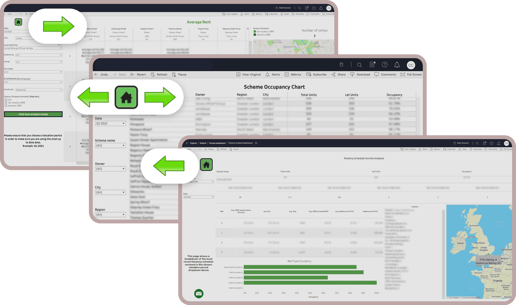
In the previous interaction, users have to go back and forth between pages to view data in the old dashboards.
Before
In the previous interaction, users have to go back and forth between pages to view data in the old dashboards.
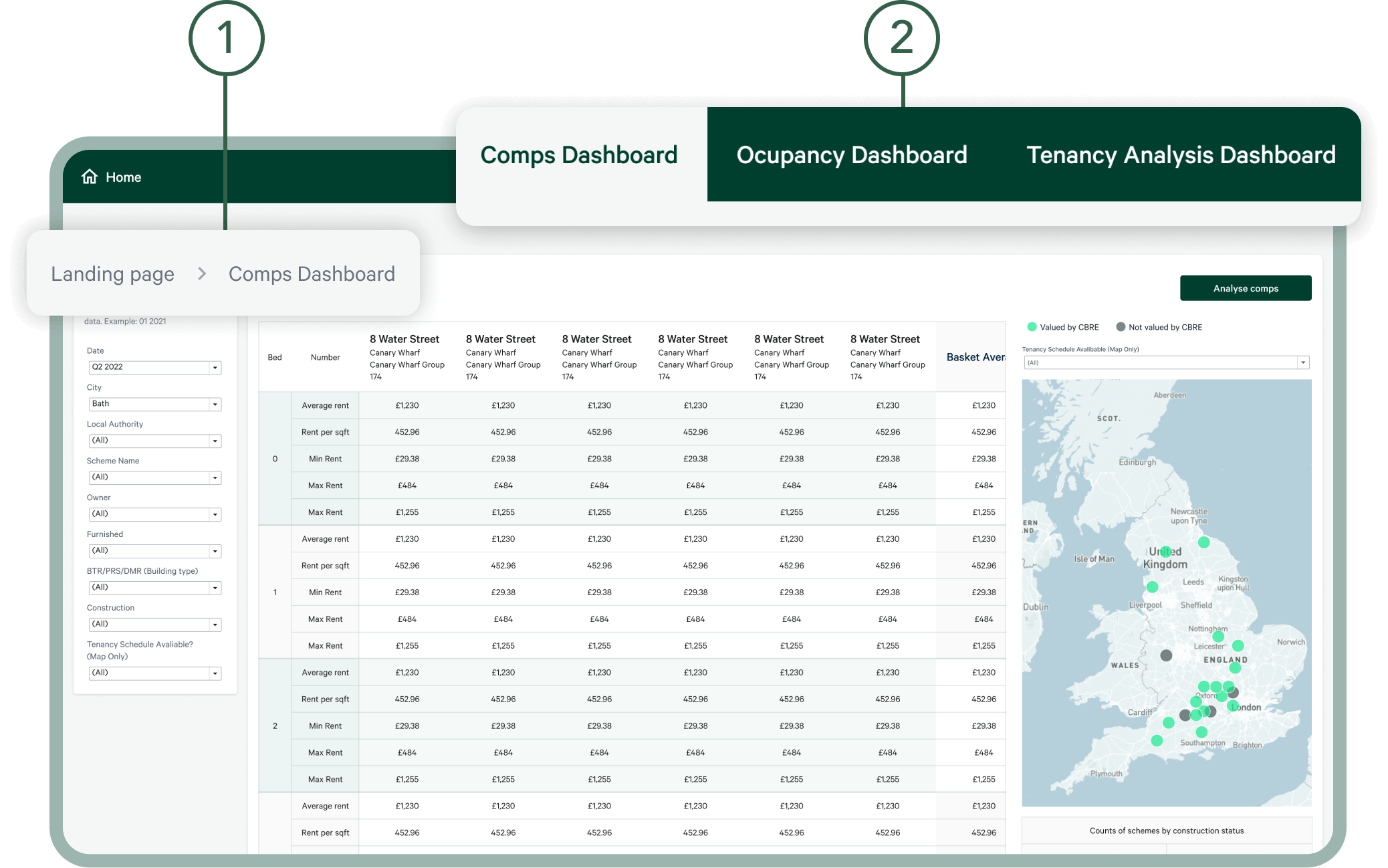


After
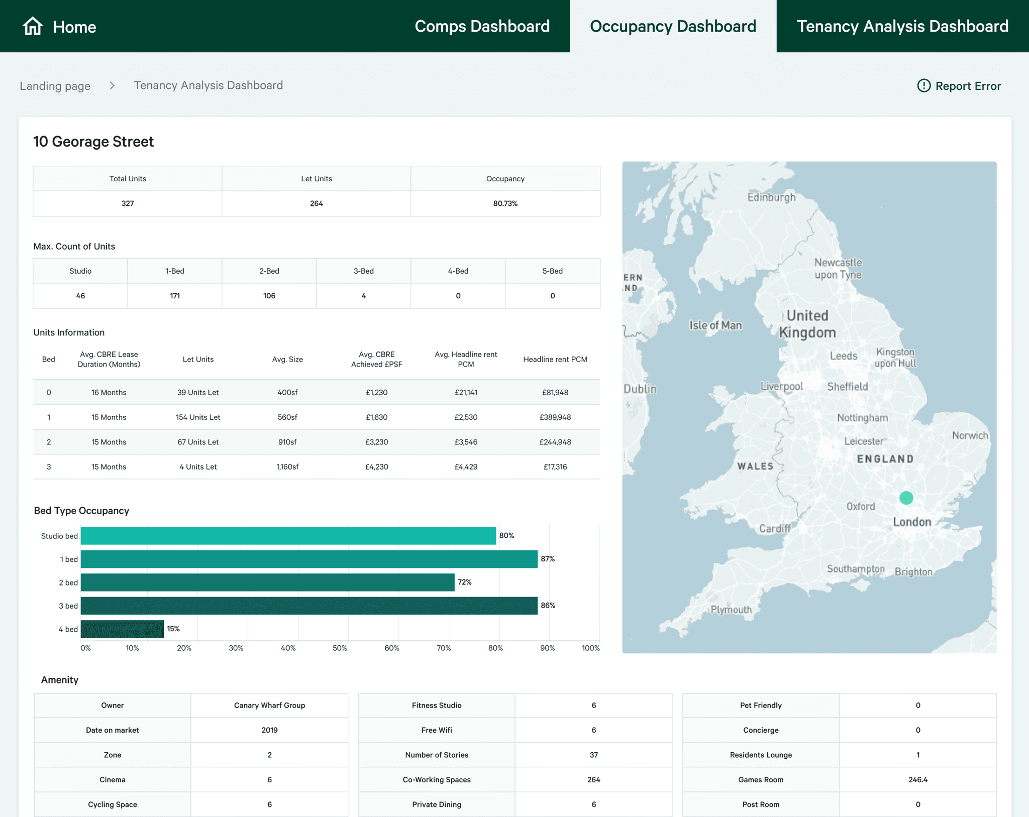
The new design has two new navigation features:
After
The new design has two new navigation features:
Breadcrumbs: Users can know their locations on the site or click to go back to the previous page.
Tabs: Users can easily switch between each dashboard by clicking on the corresponding tab.
Breadcrumbs: Users can know their locations on the site or click to go back to the previous page.
Tabs: Users can easily switch between each dashboard by clicking on the corresponding tab.
04. DESIGN
04. DESIGN
04. DESIGN
Solve Poor Readability With Accessible Design
Solve Poor Readability With Accessible Design
PROBLEM
PROBLEM
PROBLEM
Users encountered readability issues on the current dashboards due to several accessibility and aesthetic problems. This resulted in decreased efficiency for users in reading data. For example, the similar colors on map legends and low-contrast buttons made it hard to differentiate data or read the text. Also, the usage of colors and icons was not aligned with the design system.
Users encountered readability issues on the current dashboards due to several accessibility and aesthetic problems. This resulted in decreased efficiency for users in reading data. For example, the similar colors on map legends and low-contrast buttons made it hard to differentiate data or read the text. Also, the usage of colors and icons was not aligned with the design system.
Users encountered readability issues on the current dashboards due to several accessibility and aesthetic problems. This resulted in decreased efficiency for users in reading data. For example, the similar colors on map legends and low-contrast buttons made it hard to differentiate data or read the text. Also, the usage of colors and icons was not aligned with the design system.
SOLUTION
SOLUTION
SOLUTION
After conducting a comprehensive audit of all pages, I reviewed the design system documents and consulted with the design system team to recreate the dashboard design.
After conducting a comprehensive audit of all pages, I reviewed the design system documents and consulted with the design system team to recreate the dashboard design.
After conducting a comprehensive audit of all pages, I reviewed the design system documents and consulted with the design system team to recreate the dashboard design.
BEFORE
& AFTER
BEFORE & AFTER
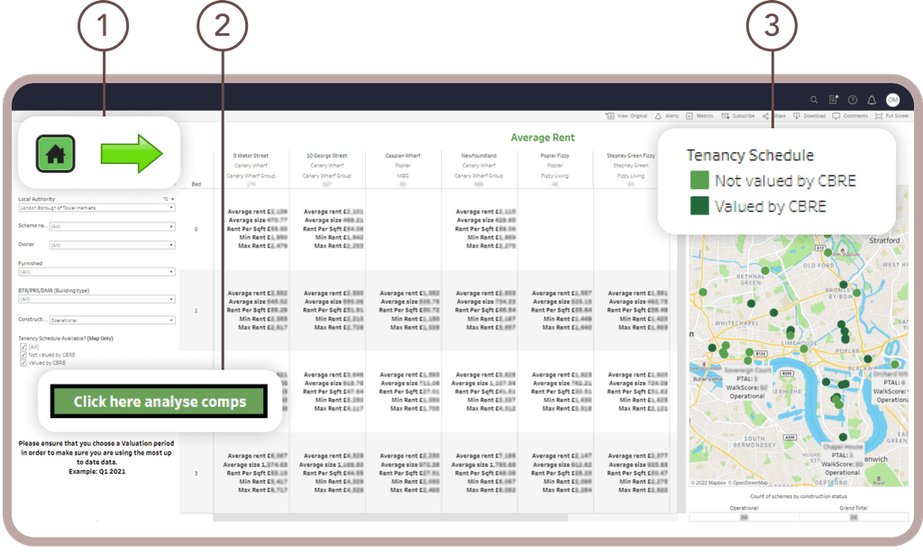


Before
When data was presented in tables, it was hard for users to compare data across years.
Before
When data was presented in tables, it was hard for users to compare data across years.
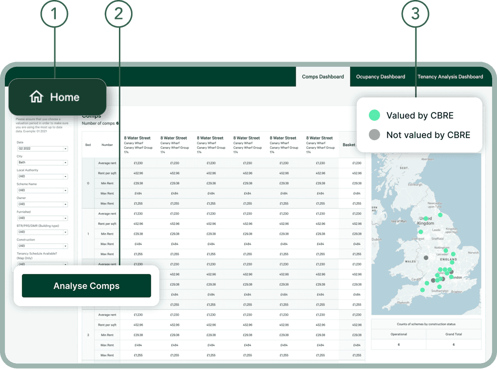


After
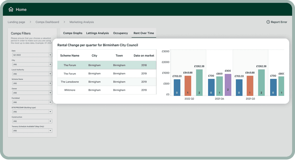
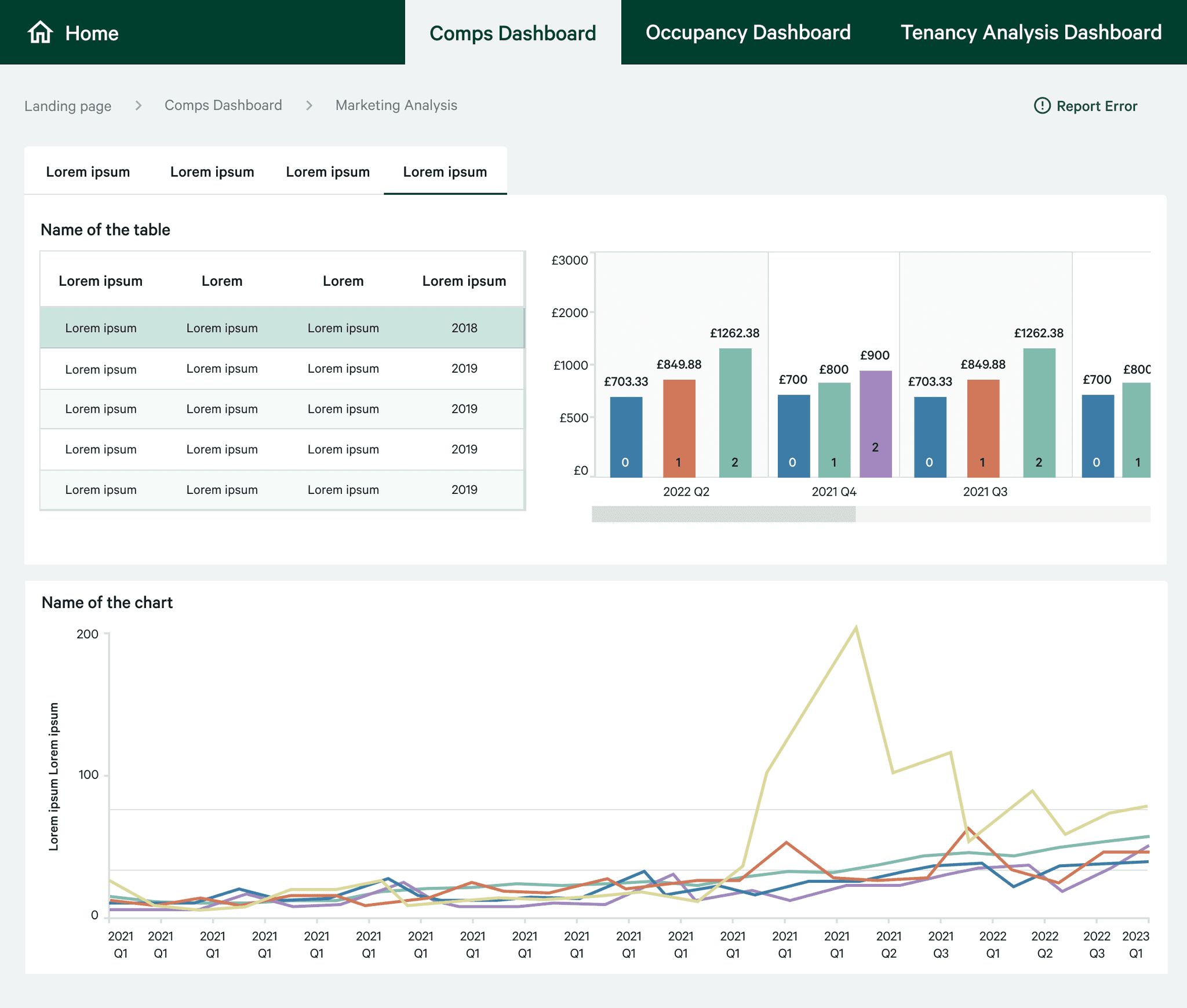
Bar charts make it easier for users to see changes across years.
After
Bar charts make it easier for users to see changes across years.
05.DESIGN
05.DESIGN
05.DESIGN
Solve Data Analysis Inefficiency with Changing Data Display
Solve Data Analysis Inefficiency with Changing Data Display
Solve Data Analysis Inefficiency with Changing Data Display
PROBLEM
PROBLEM
PROBLEM
Users found it difficult to analyze data efficiently due to the high number of tables on the current dashboards. Specifically, they requested an improved approach for comparing rental charge data across different years.
Users found it difficult to analyze data efficiently due to the high number of tables on the current dashboards. Specifically, they requested an improved approach for comparing rental charge data across different years.
SOLUTION
SOLUTION
SOLUTION
Initially, I considered using a line chart to present the rental charge data across different years, but I discovered that this approach would not work due to missing data in some years. So, I opted for a bar chart instead, which will allow users to compare rental charge data more easily. This solution will make it simpler and more efficient for users to analyze the data they need.
Initially, I considered using a line chart to present the rental charge data across different years, but I discovered that this approach would not work due to missing data in some years. So, I opted for a bar chart instead, which will allow users to compare rental charge data more easily. This solution will make it simpler and more efficient for users to analyze the data they need.
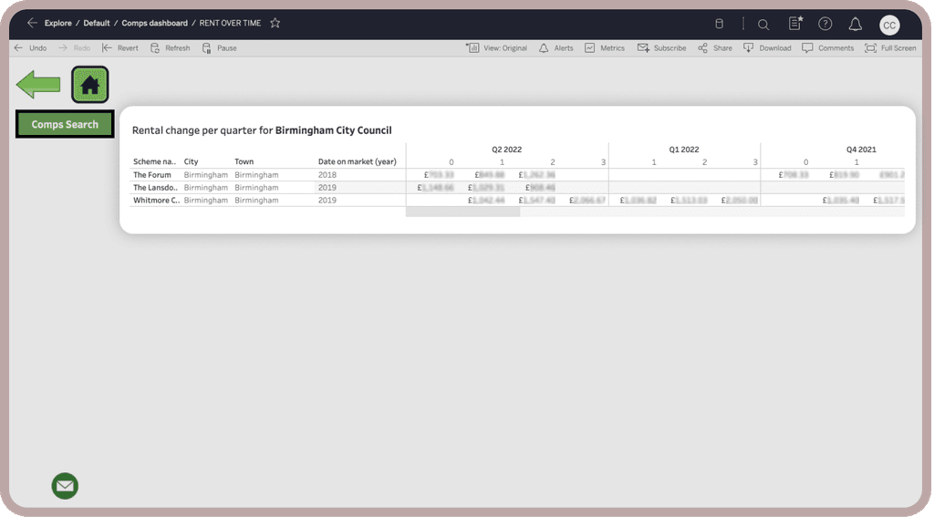


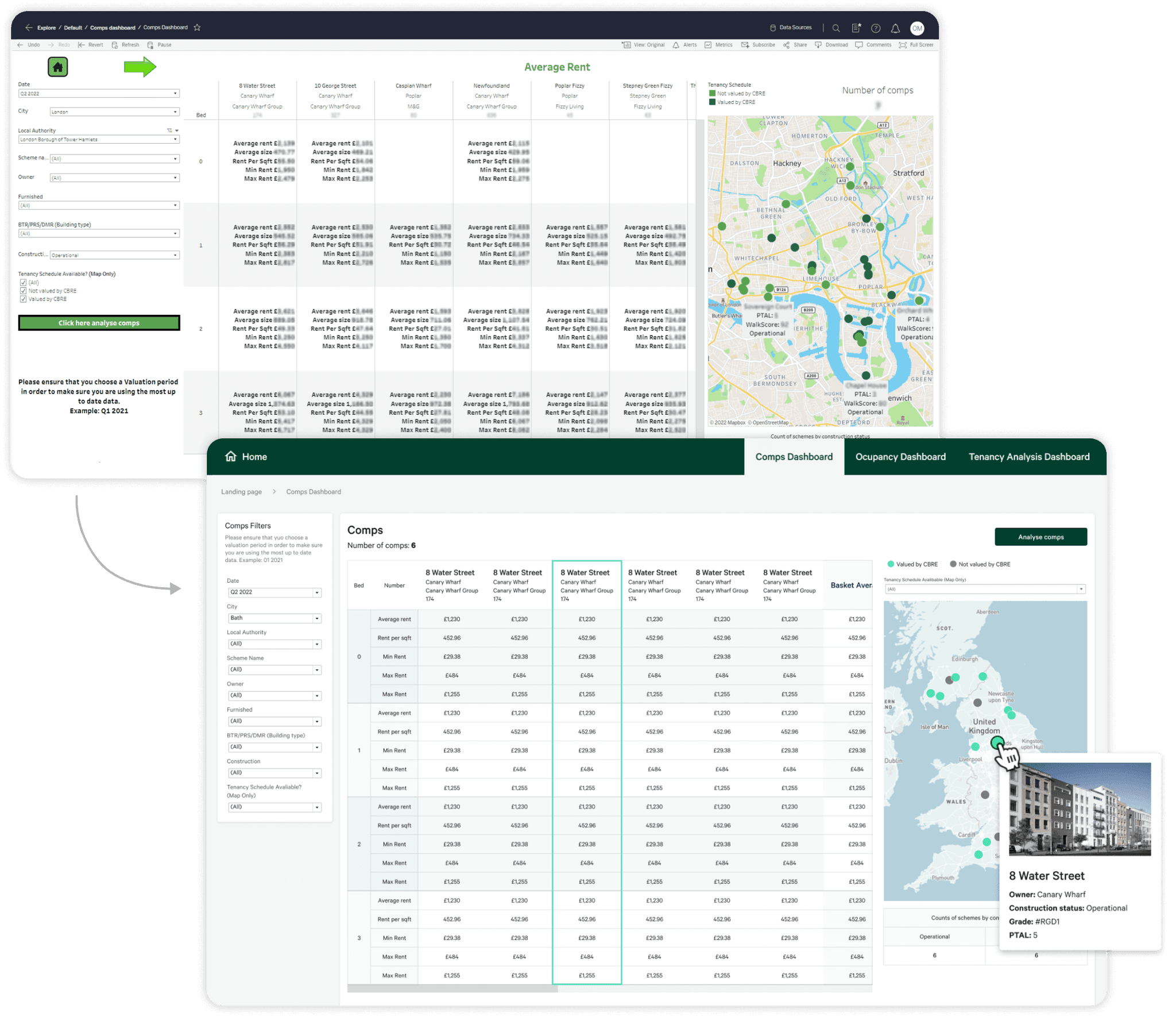
Before
Inconsistency with design system.
An accessibility issue with low contrast buttons.
The colors on map legends are too similar and make it hard to differentiate data.
Before
Inconsistency with design system.
An accessibility issue with low contrast buttons.
The colors on map legends are too similar and make it hard to differentiate data.
